Current Progress v0.0.3 pt2
Kobold Festival » Devlog
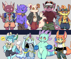
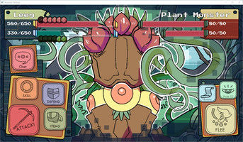
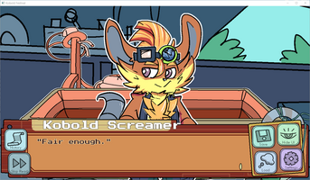


Hello. I've been working on other things too so updates will be a bit slow but so far here's what's new from the previous build.
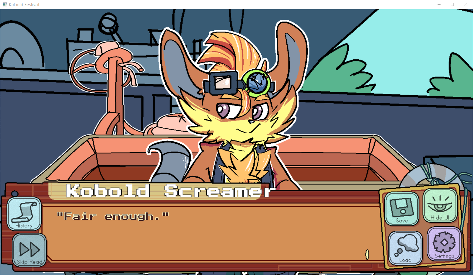
Coloring character sprites + legs

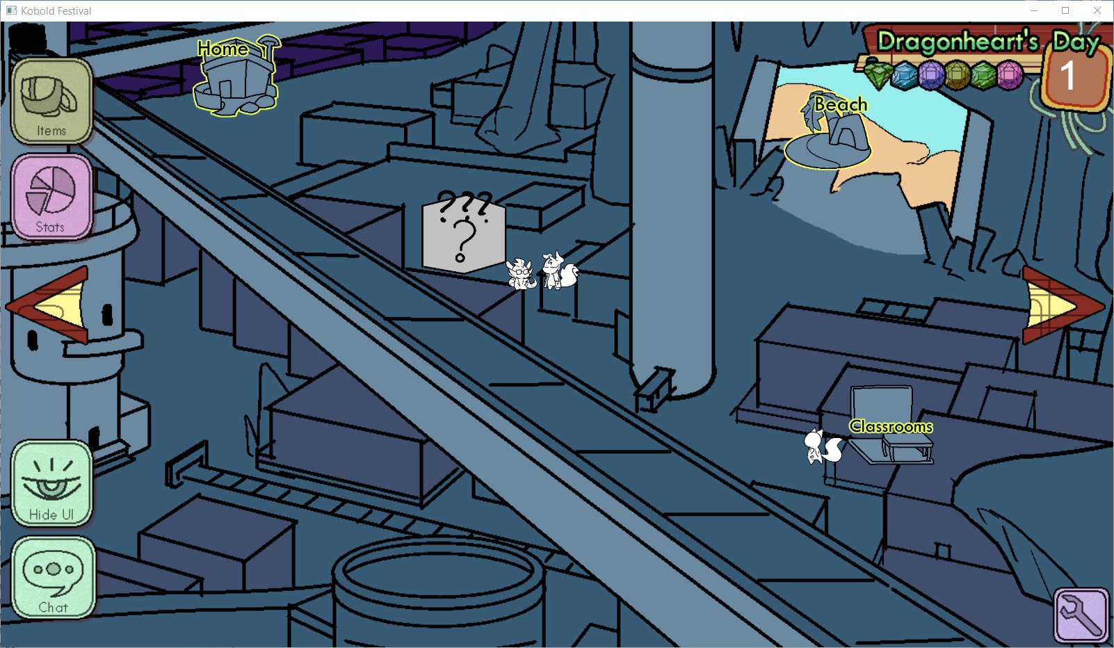
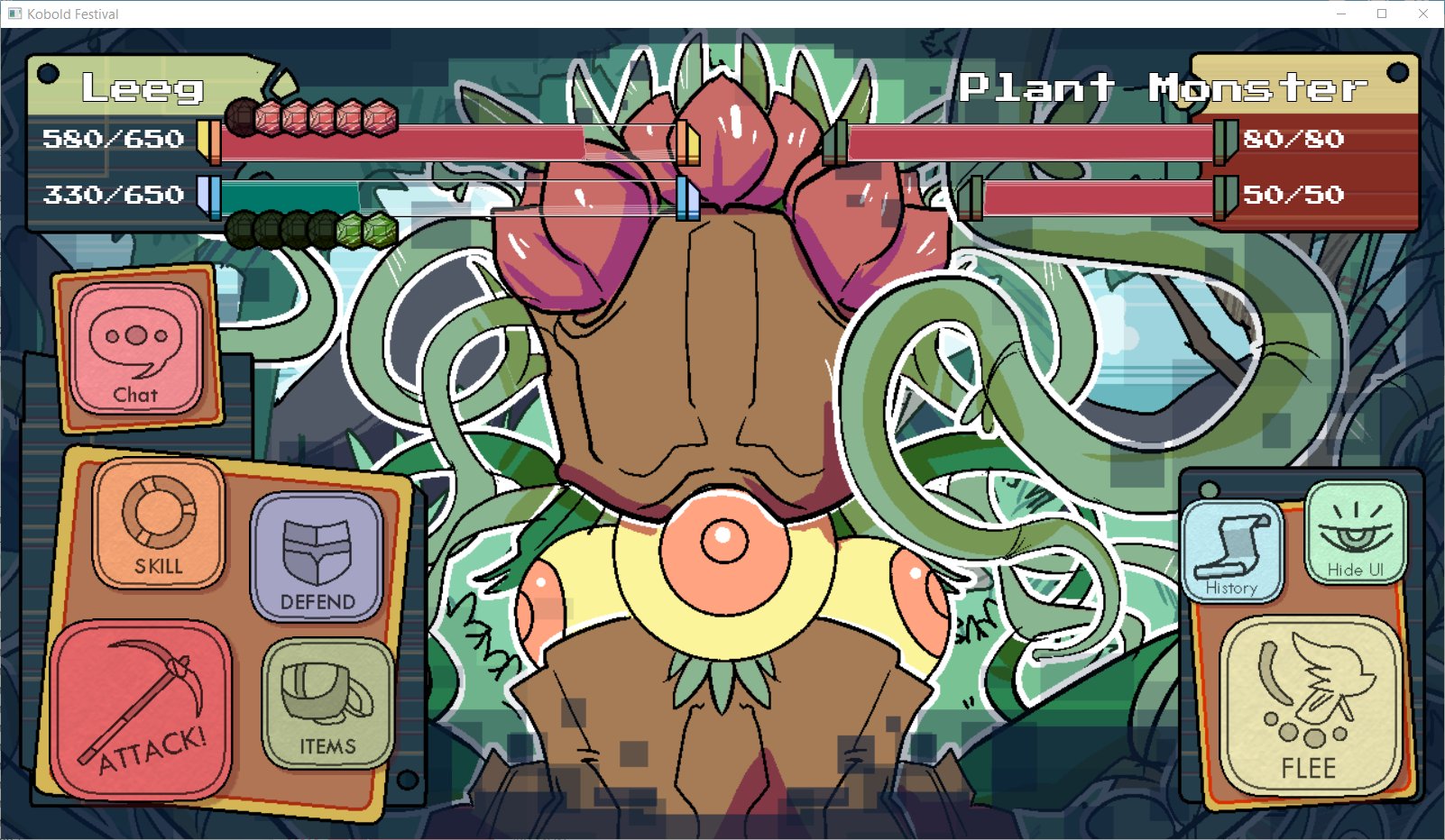
Updated GUI
...
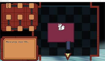
There's also an attempt in adding a simple dungeon crawl, which will first appear at the end of Day 0 but I don't have enough programming knowledge to pull it off. I experimented with a per-tile and per-room type of dungeon crawling. Per room is definitely easier to pull off and more mouse and touch-screen friendly.
Get Kobold Festival
Kobold Festival
Here be gay fuzzy kobolds.
| Status | In development |
| Author | MouseSix |
| Genre | Visual Novel, Card Game |
| Tags | Adult, Dating Sim, Furry, Gay, LGBT, Ren'Py, Singleplayer |
| Languages | English |
More posts
- Still working on itApr 30, 2024
- Life UpdateFeb 01, 2024
- v 0.0.3.165Nov 17, 2023
- v 0.0.3.163Oct 16, 2023
- v 0.0.3.15Sep 25, 2023
- v 0.0.3.1xAug 26, 2023
- updateAug 05, 2023
- v 0.0.3.01Jul 16, 2023
- Current Progress v0.0.3.1Jul 05, 2023
- Kobold Festival 0.0.3Jun 28, 2023

Comments
Log in with itch.io to leave a comment.
Heya ! It's nice getting to follow your progress.
I really love the new interface especially for fighting (I hope we get to do real fights in the future considering that).
I really like the character colorations for most except Garfield. It's not that I think it's bad it's more that he is supposed to be particularly dark and I feel like it's underepresented here especially since Swole's chest is way darker than Garfield as a whole and even the rest of Swole's body while a different shade is in the same range of darkness.
For the dungeon crawling part while I do prefer the per-tile in general but something doesn't stick right with me with the scrolling in the video maybe make the camera focus on rooms or always center it on the character because the video ? If you don't know how to do that or don't want to spend to much time working on it (if you don't plan to reuse it much) I'd say go for room-per-room but in that case maybe de-zoom a bit the general map and have the player icon on it I think, unless you plan on having different room shapes or every room having different permanent things in them and even then it's not easy to navigate with that little vision.
That's it for me, keep up the good work, can't wait for the next updates !
Thanks for the feedback! I'm pretty happy with how the ui turned out and I'm glad others do too.
For Garfield... we'll adjust everyone's colors a bit more once all the sprites are made so we can darken him then.
For the dungeon I'm still just experimenting with either but the player's supposed to be able to fight monsters, pick up gems, and interact with other kobolds so a per room thing feels more fitting.
is there a rough estimation for when 0.0.3 will be released?
Should be ready by the 23rd if nothing urgent comes up